Have you ever decided you were going to paint the walls of a room, and then when you arrive at the home improvement store to pick out paint, get overwhelmed by the sheer amount of paint chips? Or tried to pick out a color scheme for a wedding or formal event? Similarly, choosing a theme and colors for the photo book you’re making can be and endeavor. You want it to look good and match your theme. But when it comes to color, the wide spectrum of color makes for endless possibilities. So how do you decide on a color scheme?
For a little design inspiration let’s start by going over the basics of color theory.
A Splash of Color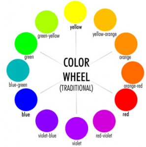
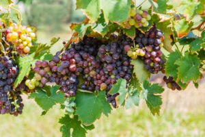
First off, the color wheel. The primary colors are Red, Yellow, and Blue. These three colors mixed together make every other color in the color spectrum. For example, secondary colors are made by mixing two of the primary colors. Red + Yellow = Orange. Yellow + Blue = Green. Blue + Red = Violet. All three of them together create brown.
Next let’s break down common terms: Hue, Saturation, Tint, Shade, and Tone.
Hue is the easy one; it’s just another name for color. Whereas saturation is how much pigment of the hue is being utilized. If it’s highly saturated it’s going to be a very bright pure color. Low saturation, on the other hand, is going to make it dull and soften the color. Completely desaturating color takes all the pigment out leaving a grey tone behind. Tint is lightening a hue by mixing in white. It softens colors and gives you pastels. The more white that’s added the whiter the color gets. Shade, on the other hand, is adding black to a hue. Darkening the color. The darker it gets the closer to black it gets. Lastly, there is tone. It’s when Grey is mixed with the hue; the more grey there is the duller the color gets.
Fortunately, technology makes it easy to find all the colors you need. No need to hand mix colors.
Color Schemes
There are many different types of color combinations and schemes, also known as harmonies. We will only be covering the more basic ones here.
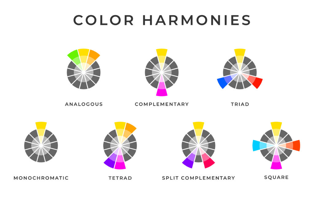
Complementary
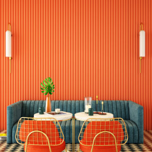
Let’s begin with the Complementary color scheme. Looking at the color wheel, colors directly across from each other are considered complementary. Possibly one of the most famous complementary color schemes belongs to Christmas: red and green. Many sports teams also utilize opposite colors, think navy blue and orange. Sometimes putting together complementary colors can feel jarring. When using this combination, it’s a good idea to choose one of the colors as the dominant one and the other as an accent.

Analogous
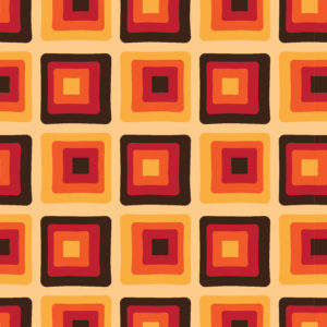
Another common combo is called Analogous. It involves using colors that are next to each other on the color wheel. Depending on how technical you want to get it can mean red, red-violet, and violet. Or it can be used as blue, green, and yellow. Either way the colors are considered next to each other on the wheel. For example, you see these types of combinations frequently in patterns and retro eras like the ’70’s.


Triad
Then there is the triad. Three colors evenly spaced apart from the color wheel. A perfect example: the primary colors. It gives good color variety and touches all sides of the color wheel.


Monochromatic
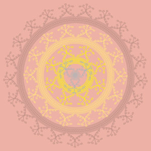
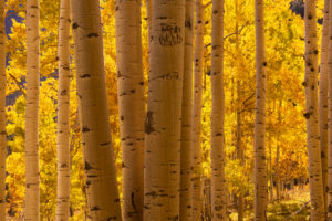
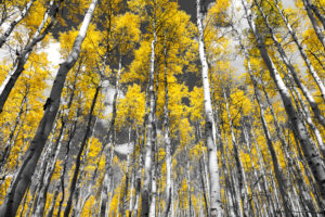
This brings us to our next color harmony: Monochromatic. It’s one hue in various shades and tints. This may sound overly simple, but it can lend itself to creativity and unity in design.
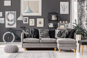


Black & White
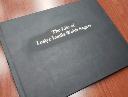
And last but not least there is always black and white. It’s a classic. If you want to add a little more variety, choose an accent color or two. This combination looks very clean, and elegant. It’s a great color scheme for wedding or formal event photo books.


Color schemes can be used in everything from photography to interior design, or a garden. These harmonies are helpful when considering what colors to use, but don’t be afraid to play around and experiment with any color combinations that you like.