
Whether creating a scrapbook, photography book, or snapping a photo, it’s important to consider the use of colors. Colors effect mood and composition. By finding and using beautiful color combinations, you can ensure your project looks amazing. But before we reveal the tricks to making great photographs using color, it’s first necessary to understand…
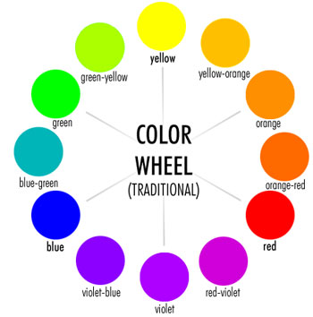
The Color Wheel
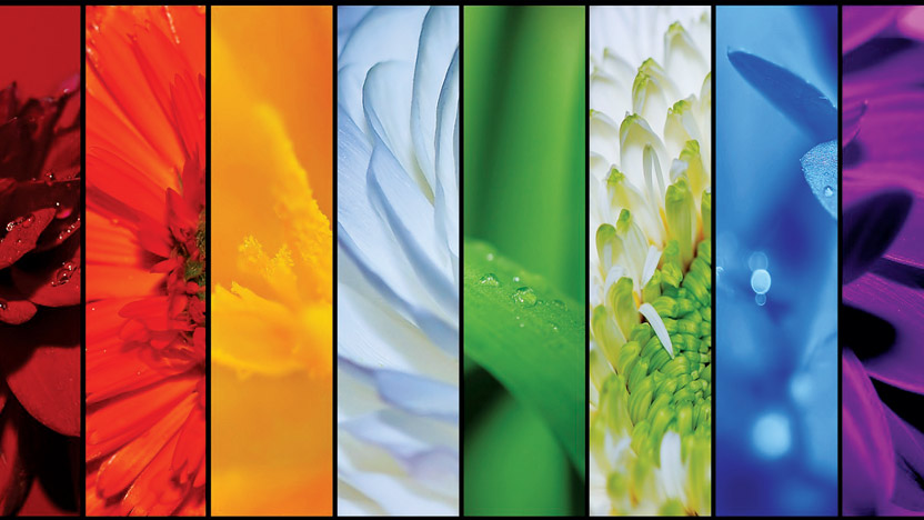
The color wheel uses all the colors of the rainbow (red, orange, yellow, green, blue, and violet) as well as the mixtures of these colors (yellow-green, yellow-orange, etc.).
A more advanced color wheel includes tints and shades, where the colors fade from darker shades around the edges, into lighter shades as they draw closer to the center:
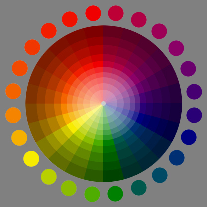
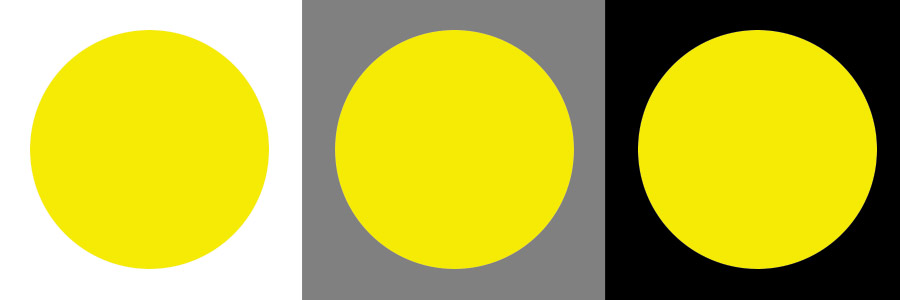
Note how these colors are presented on a gray background. The reason is that medium gray (50% white and 50% black) is a neutral shade. By presenting the color on a neutral shade, you can see the true color, whereas portraying the color on black or white (etc.) effects how the color appears. Note the example below:
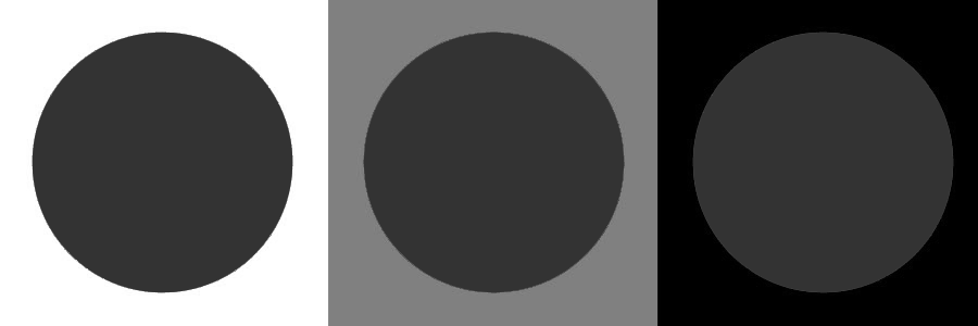
Though each circle is the same shade of gray, the one on the left feels darker, and the one on the right feels lighter because of the shades surrounding them. The same happens with colors.
The color wheel is a great cheat for finding colors that look lovely together. Consider the following color combination tricks…
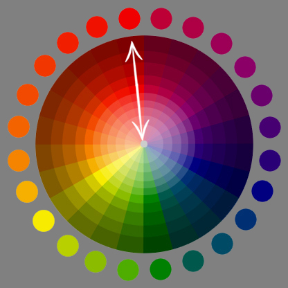
Complementary
Complementary refers to colors that are opposite of each other on the color wheel.
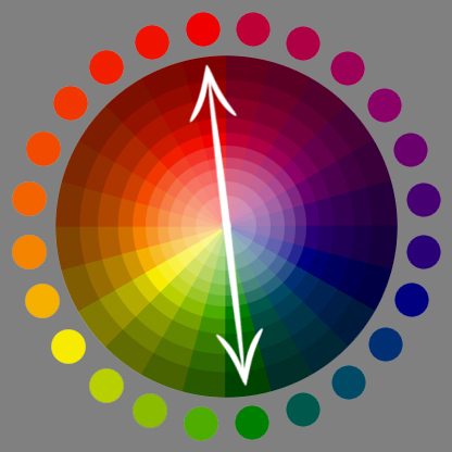
Basic color complement sets are (red and green), (blue and orange), and (violet and yellow). But why do complements look good together? Apartment Therapy, home decorating, explains that, “This is because different types of cones (the photoreceptor cells in your eye that contribute to color vision) perceive different colors of light. If you stare for a long time at a block of color and then quickly look at a white wall, you’ll see a light afterimage in the opposite, or complementary, color … So what does this mean for the decorator? It means that combinations of complementary colors are especially dynamic together … since it simultaneously stimulates different parts of the eye.”
See Complementary colors in action:


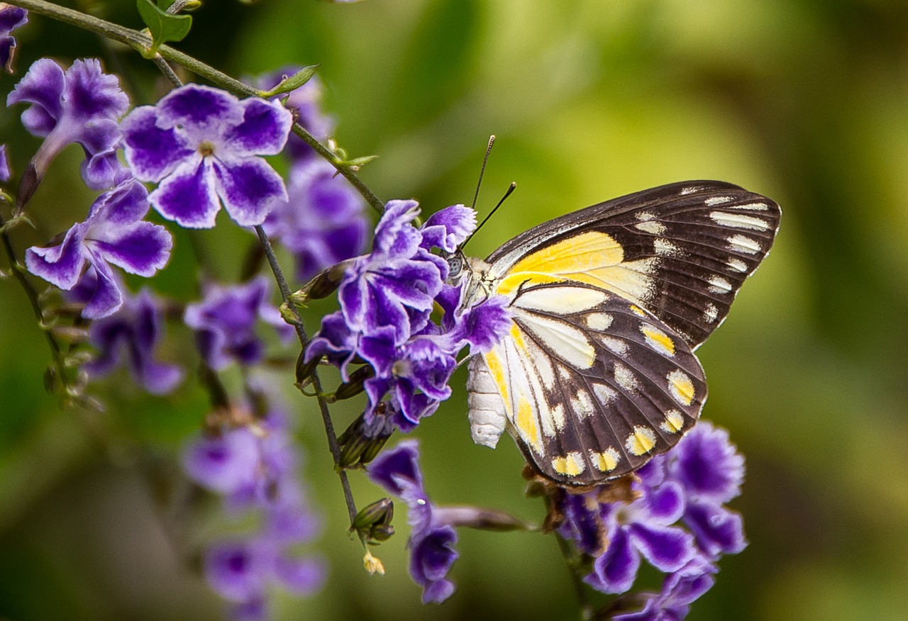
Notice how complementary colors can be used in different ratios to create pleasing effects. If your complementary colors aren’t looking good together, consider making one more dominate than the other. On average, making the cool color (green, blue, violet) more dominant will create a more pleasing effect. The reason? Warm colors (red, orange, yellow) are naturally intense and will automatically draw the attention. Use warm colors in places of emphasis. Notice how the focus in the above photos are all warm colors: red ladybug, orange rose, yellow butterfly.
Analogous
This refers to colors that are next to each other on the color wheel.

Analogous colors look nice together because the similar tones used in each color invites a feeling of unity and harmony.


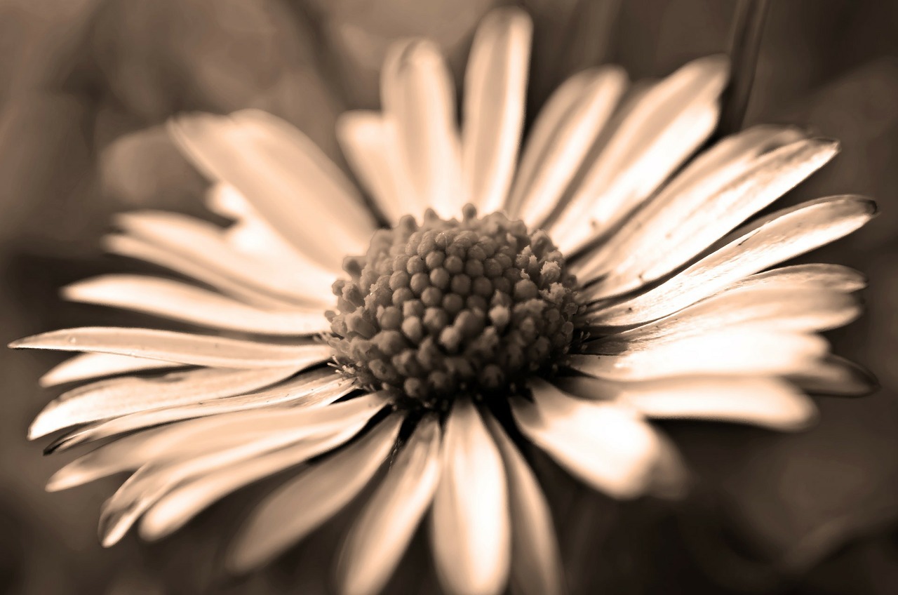
Monochromatic
Monochrome colors are different shades (adding black to the color) and tints (adding white to the color) of one color on the color wheel. For example, dark red, red, and pink.
Like analogous colors, monochromatic colors look nice together because they use similar tones to create unity within a piece. This is why sepia, as well as black and white photos, are so popular.

Colors
There are many different ways to organize and blend colors to create beautiful effects, and we’ve only mentioned a few here. If you’d like to see more examples of colors that look lovely together, check out our new color board on Pinterest!
What colors do you like best together, and why?