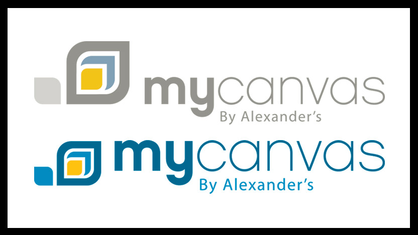
You may have noticed MyCanvas is transitioning to our new logo. Though very similar to the original, we did make some meaningful changes.
New Logo Colors
Our original logo used four colors (Yellow, Slate Gray, Dark Gray, and Light Gray). Our new logo uses three (Yellow, Blue, and Dark Blue). Though we enjoyed our time with our original logo, we felt that it was time to simplify the color pallet, as well as update the colors to more vibrant shades. We adjusted the mustard yellow into a brighter canary yellow. Similarly, we deepened the slate gray into an inviting sky blue. Though gray is a refined color, we felt that a deeper blue better represents the ideals of our company. MyCanvas is dedicated to providing our clients with beautiful quality photo products that keep memories alive. Consequently, we’ve dusted off that pale gray, and instead have vibrant blues that bring to mind the sky and fresh air.
New Logo Size
Not only does enlarging the words in our logo mean easier visibility on electronic devices, but it represents what we feel is most important about our logo – the fact that MyCanvas is “My” Canvas, or rather, the place each user can go to create personalized photo products.
An updated logo is just the beginning of the changes we have planned for this year. We are continuing to develop new calendar layouts and create family history book layouts that will make creating family history books accessible for everyone. Be sure to keep checking back in on our blog and social media feeds for the latest information from MyCanvas!


